.
Image: DocuSign
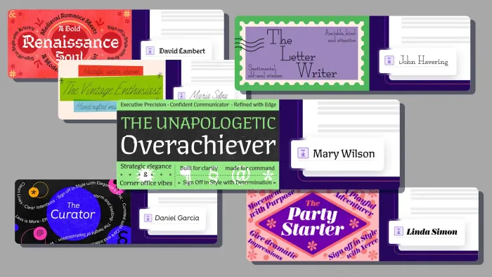
Libbie Bischoff didn’t set out to reinvent the signature.
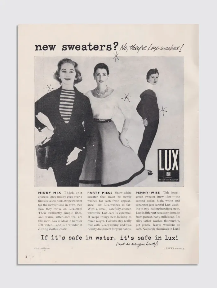
Really, she was just flipping through a vintage knitting magazine from the 1950s. The Minneapolis-based type designer collects the mags, partly because her grandmother taught her to knit, and partly because she finds incredible typography hidden within their pages. It was in one of these magazines that she found the casual, flowing script that would become one of DocuSign’s new signature styles.
Together with Lynne Yun—a New York-based type designer, calligrapher, and founder of the studio Space Type—Bischoff is responsible for the first major update to the platform’s signature options in more than 20 years. For DocuSign, a company that has processed a billion-plus digital signatures, changing the look of a digital John Hancock is no small decision. It’s a move that reflects a quiet but significant cultural shift: Cursive is fading, as is the traditional idea of what a signature should be.
A DocuSign survey found that only 51% of Gen Zers sign their name in cursive, compared to 80% of boomers. As a lover of cursive and calligraphy, I feel depressed when I read that, but facts are hard to dispute. As our most important life moments move online, it’s logical to expect that the digital signature would become a new form of self-expression.
.
Image: DocuSign
Bischoff and Yun were tasked with injecting personality into a digital interaction that can often feel sterile. Their work explores how a signature can be authentically digital by moving beyond traditional cursive to reflect a user’s personality in an era when fewer people write by hand.
.
Image: DocuSign
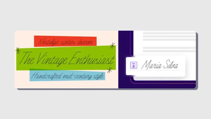
For Bischoff, the process of creating the new signatures was an act of revival. She wanted to breathe digital life into historical handwriting. The script from the knitting magazine became “The Vintage Enthusiast,” a friendly, flowing cursive with printed, upright capital letters.
.
Image: DocuSign
“The capitals are all printed, but then the cursive lowercase element of it is very fast and kind of casual and more similar to . . . how [somebody] would write their signature,” she tells me. The style carries a sentimental weight for her, evoking the era when her grandmother would have been knitting.
.
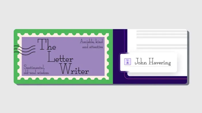
Image: DocuSign
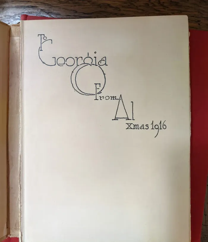
Her other creation, “The Letter Writer,” came from an even older source: a beautifully inscribed book from 1916 she spotted in an antique store. Bischoff was so struck by the penmanship that she snapped a picture. From there, she built the complete typeface—a clean, upright script with a professional feel, featuring bold caps and quirky lowercase letters. “The writing is very beautiful and just very professional,” she says. “That level of care going into a gift as simple as a book is, I don’t know, I just
.
Image: DocuSign
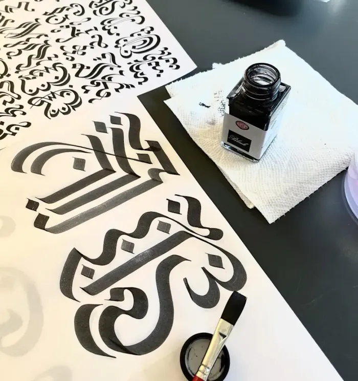
While Bischoff looked for inspiration in found artifacts, Yun got deep into the craft of calligraphy itself, exploring how the human hand could be felt in a digital format. Her four typefaces for the DocuSign project push the boundaries of what a signature can be.
.
Image: DocuSign
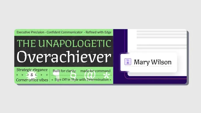
“The Overachiever” is a sharp, confident script born from Yun’s study of 20th-century Czech calligrapher Oldřich Menhart. Menhart’s work is characterized by earthy, bold, and expressive calligraphic forms. For Yun, his work was the inspiration she needed to craft a modern digital typeface that would bridge the gap between traditional and contemporary design.
.
Image: DocuSign
As a calligrapher herself, she believes Menhart provided a foundation for a new style that feels personal and expressive without falling into the common traps of being either too gimmicky or overly formal. “I wanted to embody that era of calligraphy where it’s about personal expression, but you want to express yourself, like not in a way where it’s full-on goofy or full-on like ‘Here is my crown,’” she tells me.
.
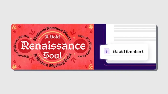
Image: DocuSign
For “The Renaissance Soul,” she took a more experimental approach. “If ‘The Overachiever’ is like, Ooh, I cross my Ts . . . I think ‘The Renaissance Soul’ is the other way, where I do what I want,” Yun says with a laugh.
.
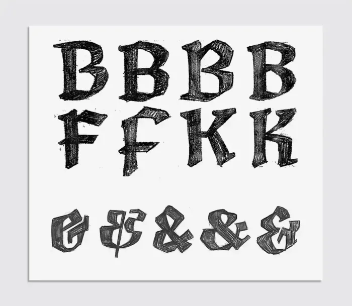
Image: DocuSign
She started by writing letters over and over with a calligraphy marker, then moved to a square brush and ink to explore how expressive the forms could get without losing legibility. The result is a bold, dramatic typeface with voluptuous curves and expressive, sculptural forms designed to command attention.
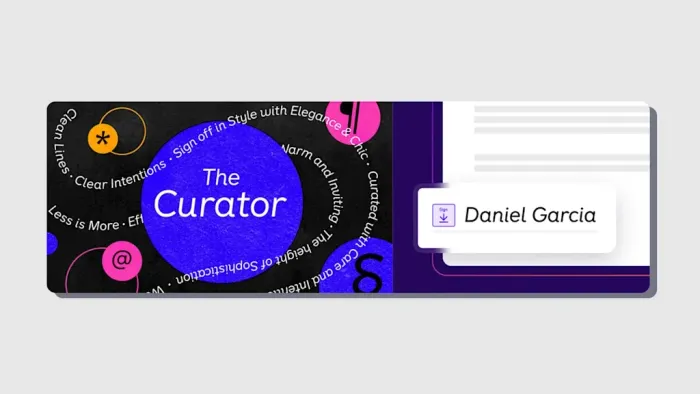
Not all of Yun’s new typefaces are based on traditional script, though. For “The Curator,” a slanted, geometric sans serif, Yun says she wanted to create a hybrid that feels modern yet personal. The challenge was to infuse warmth into a typically clean and cool style. “I purposely wanted it to feel like a very modern version of handwriting, although it is nothing like handwriting at all because it is a very sans-serif feeling,” she explains.
.
Image: DocuSign
The creative process was about playing with perception. She started with “the structure of a modernist sans serif” and then worked to give it “warm, handwritten . . . vibes.” The key to this, she says, was creating the illusion of a connected script without actually connecting the letters. “It has that notion of like, ‘Oh, it would connect if it was like a handwritten scribble,’ but it’s not,” she tells me. Indeed, it’s clean-cut but still representative of a digital-native style rooted in a personal, human feeling.
.
Image: DocuSign
Finally, “The Party Starter” is a bold, high-contrast typeface with a playful attitude, as Yun describes it, noting the inspiration for it began with a French specimen from Constantine in 1834 that she wanted to combine with the spirit of 19th-century American woodcut type.
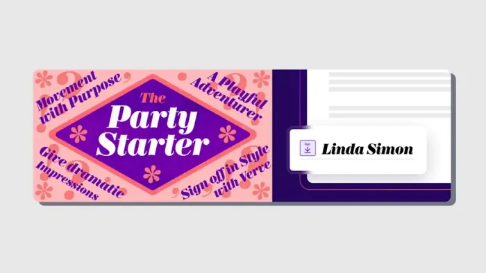
.
Image: DocuSign
“I think that in mid-century America we had a lot of big personalities. No matter what they look like, that was the vibe I wanted to capture,” she says. Yun made initial sketches that were faithful to the historical source but then intentionally deviated for a more refined, modern feel. She says she identified the “inconsistencies and quirks” in the original that worked against a harmonious texture and updated them for a modern aesthetic.
The goal was to create something with a “slightly wilder, playful appearance” that wouldn’t look out of place at a formal function. The result is a typeface defined by what Yun calls “huge contrast, like big, bold, bulk terminals”—a visual representation of packing the biggest personality possible into a small space, which feels appropriate given how small signature spaces can be in so many documents.
I still question whether people are really ready to sign a legal document with something that doesn’t look like, well, a signature.
Bischoff believes the reaction will be positive, if generational. “I think younger people don’t care about cursive-style things. I think older people will gravitate maybe towards those,” she suggests. Which is why DocuSign wanted this new generation of typefaces, of course.
Yun sees it as a natural evolution. For years, the digital world was stuck between the “super formal” and gimmicky Comic-sansy “marker writing.” This project, she feels, allows signatures to be “authentically digital” rather than just mimicking analogue tools. “I think we’ve evolved past the point of wanting to fake pens in the digital space,” she says. “And now we’re just like, ‘Hey, this is a typeface and it has a personality.’”
DocuSign claims this is all about acknowledging that in a 99.9% digital world, your digital signature should still feel like you. Yun and Bischoff tell me that it was a chance to expand the definition of digital identity. To me, being neither a boomer nor a millennial or a Z but a Gen Xer, the answer to my rhetorical question is really much simpler: Sorry, DocuSign, but your previous signatures really sucked. These new ones? They are pretty cool, even if I still hate the end of calligraphy and the actual bloody pen.
ABOUT THE AUTHOR
Jesus Diaz is a screenwriter and producer whose latest work includes the mini-documentary series Control Z: The Future to Undo, the futurist daily Novaceno, and the book The Secrets of Lego House.
FAST COMPANY