.
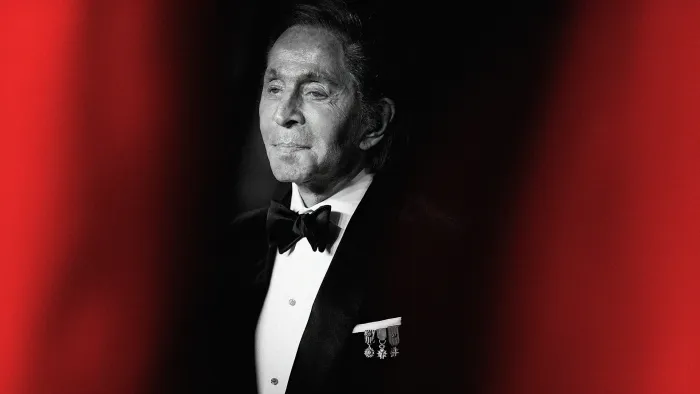
Image: Tristan Fewings/Getty Images
Close your eyes and picture the word “Valentino.” Chances are, you’re seeing a very specific shade of red. This visual imprint is part of the creative legacy left behind by the Italian fashion designer Valentino Garavani, who died at home on January 19 at the age of 93.
Throughout his career, Garavani became synonymous with red—so much so that a myth that his signature brand colour, Valentino Rosso, was once patented with universal colour-matching company Pantone has become part of fashion canon. While other designers—like Jason Wu, Richard Nicoll, and Kate Spade—have indeed made custom brand colours with Pantone, the company says that Garavani never turned Valentino Rosso into an official Pantone hue. Pantone swatch or no, one thing is certain: Valentino mastered the art of the brand colour.
Garavani founded his eponymous fashion house, Maison Valentino, in 1960, alongside his business partner, Giancarlo Giammetti. From that year to his retirement in 2008, Garavani wowed the fashion world with his romantic silhouettes and sharp tailoring, designing iconic looks for celebrities including Princess Diana, Sophia Loren, Audrey Hepburn, Grace Kelly, and Jackie Onassis (who famously wore Valentino at her second wedding in 1968).
Amid a career packed full of visionary moments, perhaps Garavani’s most enduring impact on fashion design will be his approach to colour. From the earliest days of his career, he established his own signature shade of red—a move that many modern brands make official through collaborations with Pantone. For a haute couture fashion house, it was an ahead-of-its time branding approach that made the Valentino name unforgettable.
Garavani’s love affair with red began even before he founded Maison Valentino. He debuted his first red dress, called “Fiesta,” in 1959, featuring an orange-leaning red tulle with a skirt full of rosettes. In the 2022 book Valentino Rosso, Garavani wrote of the color: “I think a woman dressed in red is always wonderful.” He added: “She is the perfect image of a heroine.” From 1959 onward, he would include at least one red dress in every one of his collections.
In 1985, Giammetti explained this pattern to Vogue: “Valentino has superstitions that became status symbols. He did red once, and now you have red in every collection. Most of our statements came to be because we are romantic; we don’t like to throw away things we like or that bring good luck.”
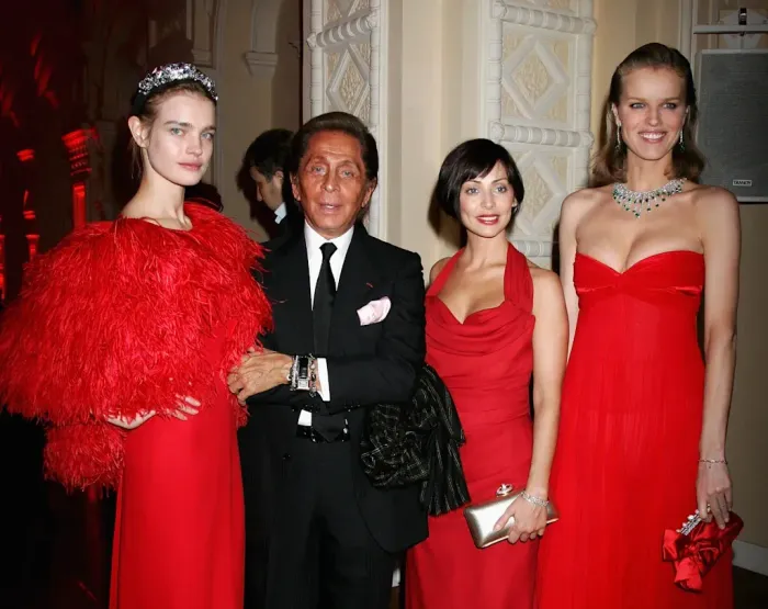
Natalia Vodianova, Valentino, Natalie Imbruglia, and Eva Herzigová at a gala honoring Valentino in Moscow in 2008.
Image: Chris Jackson/Getty Images
Despite the ubiquity of Valentino Rosso, the shade isn’t an official Pantone colour. According to Laurie Pressman, vice president of the Pantone Colour Institute, the company has no record of creating a custom Valentino red—though, she adds, the colour mix he used was reportedly a combination of 100% magenta, 100% yellow, and 10% black. After Garavani’s retirement, Valentino did get its own Pantone colour in 2022, under then-creative director Pierpaolo Piccioli, who used a custom pink to establish his imprint on the brand.
In many ways, Garavani’s obsession with his signature colour presaged the modern era of luxury branding. Over the course of the past two decades or so, brands including Bottega Veneta, Tiffany & Co., and Hermès have made their own keystone colours (green, blue, and orange, respectively) more prominent in their branding.
In an interview with The Wall Street Journal in 2022, Pressman explained that newer companies are leveraging colour to stand out in a crowded digital market. Rather than waiting to develop a signature brand colour over time, they’re looking to establish one as soon they come to market. “Now, what took years doesn’t [anymore], because we’re seeing it on a phone every day,” she told the publication.
Garavani instinctively understood the power of colour to send a message, long before it was a necessity for digital communication—and his lucky hue became his brand’s biggest asset. “It has such vitality and allure that I don’t just like seeing it on clothes, but on houses, in flowers, on objects, in details,” he wrote in Valentino Rosso. “It is my good-luck charm.”
“That red is a bewitching colour, standing for life, blood and death, passion, love, and an absolute remedy for sadness and gloom,” Pressman says.
Valentino did not respond to a request for comment.
ABOUT THE AUTHOR
Grace Snelling is an editorial assistant for Fast Company with a focus on product design, branding, art, and all things Gen Z. Her stories have included an exploration into the wacky world of Duolingo’s famous mascot, an interview with the New Yorker’s art editor about the scramble to prepare a cover image of Donald Trump post-2024 election, and an analysis of how the pineapple became the ultimate sex symbol.